Saturday 31 March 2007

Painting and Sculpture Soutine Piece


I wanted to create more texture, so applied the paint thickly to build up layers.
The 'copy' of Soutine built-on. I still feel it is extremely FLAT! I need to change my painting method! I want to capture the turbulent strokes like the original artist did. The actual piece is titled Side of Beef and Calf's Head. When it comes to meat paintings, I prefer the style of Jenny Saville, such as in this particular piece:


Chaim Soutine: Side of Beef and Calf's Head

I like the brush marks in Saville's because it gives a 'crisp', clean style which I really admire. But that's not to say that I don't feel Soutine's piece to be strong; with Saville's, it is quite clear that the thing being painted is dead - the pale colours indicate the coldness of death, but the vivid yellows and reds in Soutine's give off a great vibrancy and movement through the use of such 'active' brushstrokes.

Eventhough I find it difficult to copy Soutine's painting (most notably the liveliness of it) in response to really looking hard at it, it makes me see what I'm not doing right and lets me know what I can improve on just by attempting to do the same thing. In terms of where my main interest lies most between formal properties of painting, I think composition and line first, and colour second. I'm most interested, firstly, in how the image is arranged on the canvas, etc and in what style the image is constructed through looking at the lines and brushmarks made.


A second copy, trying to get the shape more accurate to the original but I prefer the tones on the first one, even if both have only just one 'base' layer each at the moment.


Copying in acrylics, with just a flat 'base' which could be built on.


A quick copy with colour wax crayons.


A pencil sketch copy.


The actual painting by Soutine.


A photocopy of the original image we had to copy.

Tuesday 27 March 2007

Painting and Sculpture Object Painting


Object Painting
I took the oil painting home to build on because I felt the original wasn't exploring tone effectively. I found it difficult to capture all the different tones, and had simplified the shape into sections of colours. Instead of putting much thought into how the structure would relate to the background, I simply used a dark tone overall to make the lighter form stand out. However, the second time I came back to it, I tried to do something more interesting - tried to soften the edges of the object by applying some white to the background on its right. I forgot to take a photo of how it was before, to compare, but basically it was very stylised - too stylised - I think. It was more or less just chunks of colour without any sense of smoothness/merging of the tones. I am a bit more pleased with it now that I have built on top of it, but I can't bring myself to finish it off completely.. I am contemplative over the very bottom - where the object rests. I want to leave it as it seems to give the image a more three-dimensional feel, but to others it may just seem unresolved.

This task especially agrees with the idea in John Berger's essay, that you can only capture your own 'forseen ideal moment' when the object being looked at is always changing, in the sense that paintings of the same thing still end up turning out completely dissimilar to one another, due to the alternating perspectives. It was interesting to see how different everyone's was.


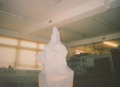
Scanned photos of the structure we did the oil paintings on.

Tuesday 20 March 2007

Painting and Sculpture research

Right! As soon as I am able to get my hands on a digital camera, I shall be putting up photos of the life drawing and oil painting. Bear with me! Meanwhile, here's some artists which have interested me.


The Musicians and St John the Baptist with a Ram, both by Caravaggio. I love the artist's use of tone; the contrast between light and dark especially, which makes the figure/s stand out vividly.


A portrait of Mrs. Henrietta Morris and her Son, by George Romney. Again I am taken by the luminosity of the skintones and the use of a solid black in part of the background.


The same sort of thing in this Portrait of Simonetta Vespucci by Botticelli. I like the use of a solid colour in the background to enhance the figure.


Whilst browsing artwork by various artists of the Renaissance period, I came across one particular piece which perspective I found, to be instantly different to the others and interesting to look at. I've always found foreshortening to be tricky..This one's The Lamentation over the Dead Christ by Andrea Mantegna.


This might be the sketch for a painting, or just a sketch on its own..either way, I like the lines and that subtle use of the orangey-red. It depicts the fall of Phaeton by John Runciman.


For this piece, titled Thieves' Punishment by Henry Fuseli, I especially love the variation in tone, the way white is used to highlight and black, to add 'weight' to the figures to the left, giving that look of solidity.


Again, I like the variation in tone for this one, Milo of Crotona, by James Barry. The use of earthly tones gives it a warmer appearance as opposed to the grey/black, and I think the classic, central positioning of everything to be very pleasing to the eye.


A 'cooler' choice of tones this time, in The Blashphemer by William Blake. The lack of 'warmth' in the colours, plus the context of the image, seems to spell DOOM!


Originally, I didn't think much of this image, created with a use of graphite, ink and wash onto paper. The tones in the background are nice, but I thought the figures weren't defined enough. They seemed too 'light' to me, ready to fade away. But then I saw this version:


And whilst the lines are definately more stark, there is a loss of that lovely background from before. Maybe I should attempt a combination of the two! Both pieces are titled Prometheus Bound.